 |
| Book Covers Sell Books |
'Put on your best face', 'Put your best foot forward', etc., etc., are sayings that convey making the very best first impression.
Marketing yourself, so to speak.
In the case of books and magazines, the covers ARE
the first impressions and the ultimate, initial marketing impacts (enormous sales made just from covers).
What do you think are the best secondary and on-going marketing impacts? - This writer thinks its probably reviews, word of mouth and social media today.
Anyway, I thought a review of the critiques of leading magazine covers for 2012 given in the December, 2012, FOLIO: magazine would be enlightening and fun:
Every month, FOLIO: selects a small group of designers and art directors to offer critiques on visually-engaging magazine covers. The cover, after all, is the first point of entry for any magazine, retail or otherwise.
This past year has produced a variety of arresting cover images that are designed to capture the attention of a reader and, ultimately, capture a sale. Here, FOLIO: rounds up six designers—including our own—and asks them to weigh in on their favorite cover of the year.
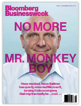
TITLE: Bloomberg Businessweek
ISSUE: January 16-22
CIRCULATION: 993,267
PUBLISHER: Bloomberg L.P.
CREATIVE DIRECTOR: Richard Turley
“I remember the moment I first saw this issue on the stands—I either said, or maybe just thought, ‘Oh, _ _ _ _.’ I know it’s not for everyone, it’s not slick—it’s sick. I know, it’s not fair, as art director Richard Turley is allowed to do anything he wants over there, but the thing is, he does it!
This could have been the hundredth iteration, or the first one just tossed off. Who cares? It’s more powerful and memorable than any of the made-by-committee, hand-lettered, 10-color covers around. The ‘What Me Worry?’ photo reminiscent of MAD magazine, the crazy cover lines and their placement, the garish overall one-color scheme—what’s that doing on a commercial, serious, nay, kind of boring, business magazine? It’s being awesome, that’s what.”
- Helene Silverman, Design Director, Architectural Record
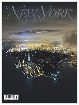
TITLE: New York
ISSUE: November 12, 2012
CIRCULATION: 405,149
PUBLISHER: New York Media LLC
DESIGN DIRECTOR: Thomas Alberty
“Few covers this year had as much visual and emotional impact as New York magazine’s cover story on Hurricane Sandy. In this day and age when newsstand sales dictate that covers be loud and garish with multiple cover lines and inane promises (BETTER SEX NOW! KILLER ABS IN 7 DAYS!), it’s refreshing to see a sober and simple approach to such an important topic. The cover photo—showing a divided Manhattan—and the restrained use of type speak volumes. The work is both stunning and somber and should remind all art directors that an effective cover need not yell at its audience.”
- Todd Johnson, Creative Director, D Magazine Partners
“This has to be one of the toughest assignments I have had this year—to pick my favorite cover from the last 11 months. To make sure I had covered my bases I searched covers online, went to websites of my favorite magazines, reviewed blogs, and looked through the piles on my shelves. But, in the end, I chose the cover of a magazine sitting on my coffee table (yes, it was actually on my coffee table).
The November 12 cover of New York magazine, “The City and the Storm,” is successful on multiple levels—for graphic impact, telling a story, maintaining a brand, and paying attention to the details of design. And the magazine staff managed to create this cover and issue while dealing with their own loss and devastation.
When you first look at this cover it is quiet and poetic. But then it pulls you in and makes you wonder what it would feel like to be on one of those dark streets, cold apartments and wrecked homes. In the Letter from the Editors they note selecting this image for the cover was “the easiest part of a harried three days…the clear choice for the way it fit the bigger story...about a powerful city rendered powerless.” I have not lived in NYC since 1995, but New York magazine always makes me feel connected through its honest celebration of the city and people.
Finally, the design of the cover celebrates the photo with a subtle logo, small headline, and date in black. All the details sit back and let the photo tell the story. Beautiful.”
- Kelly McMurray, Creative Director, 2communiqué
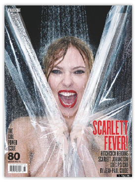
TITLE: V Magazine
ISSUE: Winter 2012/2013
CIRCULATION: 100,000
PUBLISHER: Visionaire Publishing
ART DIRECTOR: Sandra Kang
“A naked Scarlett Johansson on your cover is probably enough for newsstand success. But the creative team at V Magazine didn’t simply rely on the ‘sex sells’ mantra for their Winter 2012/2013 cover. This issue features the lovely actress recreating the iconic Psycho shower scene and there are really a lot of great things going on with this cover.
The image itself is striking and immediately recognized by most readers. It’s also cleverly cropped and composed, allowing the “V” logo to nicely blend into the shower curtain. Cover lines are kept simple and sparse, letting the image remain the focal point. Finally, the story and image are also relevant and timely, coinciding with the release of the new biographical drama ‘Hitchcock,’ which was released one week after this issue hit newsstands. All these things add up to a unique, clever, intriguing, and well-composed cover!”
- Daniel Trombetto, Creative Director, R7M Publishing (Publisher of FOLIO:)
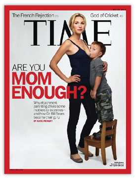
TITLE: TIME
ISSUE: May 21, 2012 | Vol. 179 No. 20
CIRCULATION: 3,276,822
PUBLISHER: Time Inc.
DESIGN DIRECTOR: D.W. Pine
“There were many great covers in 2012, so choosing one was a close race. I generally lean toward a cover that conveys a range of topics through subheads and typography that give the readers a more broad appeal (such as my close runner up in Esquire’s January 2012 cover). But, this cover from Time magazine is too impactful to overlook. I remember when I first saw this cover I thought, ‘Wow, what stones of them!’ I recalled all the chatter amongst the cubicles and offices and I immediately knew that regardless if you agree or not with the subject matter, this cover is a winner!
Our goal as designers and art directors is to make an impression to get readers into our pages and talking about our brands. In my opinion, this cover wins all races in 2012. Despite the simple nature of the cover and image, it’s the shock factor that got me, and the nation. Simple, clean and airy—not too much type to distract, but just enough to provoke.”
- Luke Hodsdon, Director of Design, Churm Media Inc.
Read and learn more
Get the Writers Welcome Blog on your Kindle :)))


No comments:
Post a Comment